You could have coloured it in a bit better.
hmm...can i recommend the use of reference to get proportions accurate?
He looks Anorexic
thus, my suggestionGooners wrote:
He looks Anorexic
liquidat0r wrote:
You could have coloured it in a bit better.
OmniDeath wrote:
hmm...can i recommend the use of reference to get proportions accurate?
Nothing positive to say? This is ART, and I don't think it is intended to be a realistic look ... just an artistic look.Gooners wrote:
He looks Anorexic
Saark, it looks great. I like the stylized way that you worked the colors and the black border lines, and I think the color selection is smooth and non-distracting ...
Other than that, it sucks.
(just kidding on that last line )
I told you that a tablet would own your face. It will own. your. face.
from now on, that is.
from now on, that is.
Nice job, but i agree with Omni, it would look alot better with better proportions.
But well done.
But well done.
~ Do you not know that in the service … one must always choose the lesser of two weevils?
OrangeHound wrote:
Nothing positive to say? This is ART, and I don't think it is intended to be a realistic look ... just an artistic look.
Saark, it looks great. I like the stylized way that you worked the colors and the black border lines, and I think the color selection is smooth and non-distracting ...
"Artistic look?" That doesn't even make sense. Now, It obviously isn't realistic, nor was it probably intended to be, and it is in the style that all of Sarrk's things are. (Don't get me wrong, it's not bad...I'm getting there)
My guess is you (Sarrk) don't do any preliminary sketching, and probably just jump in. So lets say you start drawing a head but don't plan where the legs will be...this may make your character look stretched out. Just layout where you want the figure to be and go back and make adjustments before moving on to keep things "accurate."
Also, it may help to do different poses. Most of what I've seen of yours is all roughly the same pose. Try taking another picture of someone and something and copying its general shape. This will help for the proportional and later pose. Then use this generic form and let your creativity take over and fill in the details. I happen to like this drawing, and you have a lot of creativity to fuel your talent...just take it to the next level.
So don't get me wrong, I wasn't trying to criticize, I was trying to be constructive...
Last edited by OmniDeath (2007-05-28 00:07:44)
That is one bad ass red knight/demon thing you guys have going on...helluva a lot better than I could do.
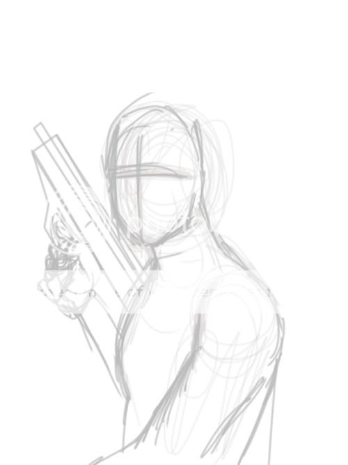
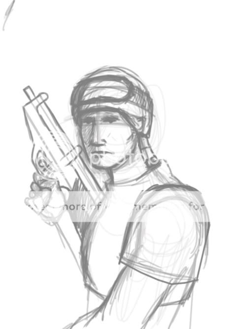
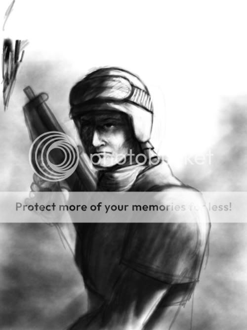
yer, i found it really hard when i first realised that everything i did was very formulaic, many moons later however it has helped a lot to, er basically paint stuff i dont want to paint ( like when i do noses at odd angles.....ARGH ). i had to do a lot of sketching ( i cant think what its called now, but basically when u use circles and oblongs to depict body parts ie: circle for the shoulder, oblong to the elbow, oblong to the wrist etc.) before i got it half way decent but its a great way of getting proportion and movement into pictures of people. ill try uploading a sketch of something relevant in a mo to show u what i mean.OmniDeath wrote:
OrangeHound wrote:
Nothing positive to say? This is ART, and I don't think it is intended to be a realistic look ... just an artistic look.
Saark, it looks great. I like the stylized way that you worked the colors and the black border lines, and I think the color selection is smooth and non-distracting ...
"Artistic look?" That doesn't even make sense. Now, It obviously isn't realistic, nor was it probably intended to be, and it is in the style that all of Sarrk's things are. (Don't get me wrong, it's not bad...I'm getting there)
My guess is you (Sarrk) don't do any preliminary sketching, and probably just jump in. So lets say you start drawing a head but don't plan where the legs will be...this may make your character look stretched out. Just layout where you want the figure to be and go back and make adjustments before moving on to keep things "accurate."
Also, it may help to do different poses. Most of what I've seen of yours is all roughly the same pose. Try taking another picture of someone and something and copying its general shape. This will help for the proportional and later pose. Then use this generic form and let your creativity take over and fill in the details. I happen to like this drawing, and you have a lot of creativity to fuel your talent...just take it to the next level.
So don't get me wrong, I wasn't trying to criticize, I was trying to be constructive...
er right soz if this is a bit shonky but it kinda illustrates what i was on about lol (its WIP btw and not the perfect example but was all i could find because i had to delete hundreds of sketches to free up some HDD space last night unamusingly)
this is the good thing about tab's no more rubbers or white spirit, or for that matter waiting weeks for oil paints to dry. yay!
1:

2:

3:

Last edited by [THE] comben (2007-05-28 04:11:19)
Comben if those are yours... Wow
ta. did that illustrate my point about the circle/oblong thingy tho? i forgot to say i did these in corelpaint not photoshop ( i HAVE to have a blender tbh lol).
I could be good at drawing, if I:
[*]Use that book I borrowed from my school library,
[*]Used a program that had layers. Paint's uses only go so far...
[*]Actually try and learn to draw faces. (I can get a body, clothes, extras etc... but I can never get the faces)
[*]Use that book I borrowed from my school library,
[*]Used a program that had layers. Paint's uses only go so far...
[*]Actually try and learn to draw faces. (I can get a body, clothes, extras etc... but I can never get the faces)
