Gooners
Wiki Contributor
+2,700|6844

Lately I have noticed many people requesting borders around their signitutres. So I made this tutorial, so that YOU can make your OWN border.
I felt this needed its own thread, to make it easier to find.

https://i191.photobucket.com/albums/z298/Dhanjal1/Border-Tut.png

My first Tut. so Critiscm and comments welcome.

Last edited by Gooners (2007-06-22 10:39:23)
Z-trooper
BF2s' little helper
+209|6971|Denmark
Haha let me guess..

voodoosniper7 is the reason you made that guide

was trying to explain how to make a border on his "sonic" sig, but over xfire my advice wasnt easy to follow so he said he'd try asking you instead at least I think it was you.. good job, but I feel like there are 2 other major ways of making borders thats not being discussed:

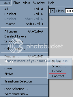
https://i192.photobucket.com/albums/z232/Z-trooper/Misc/border.png

the border feature, just enter a width of the border..
and the expand. just expand your selection by 1-2 px, create a new layer, fill it with the border color and put it behind the "signature box"..

still a good little guide, good advice if people dont want a single colored border. +1 for the effort

Last edited by Z-trooper (2007-06-22 11:02:38)

Gooners
Wiki Contributor
+2,700|6844

Thx Z-Trooper. I'm going to make another Border Tut soon. A more complex one
Entertayner
Member
+826|6783

Nice work mate!
Z-trooper
BF2s' little helper
+209|6971|Denmark

Gooners wrote:

Thx Z-Trooper. I'm going to make another Border Tut soon. A more complex one
this one is fine.. no doubt about it.. your guide deals with making "transparent" / not-one-colored borders.. I dont use it that much, I like the clean single color border.. but thats just a matter of taste! keep up the good work. good to see some more contributions so more people can learn about the joys of photoshop!
Gooners
Wiki Contributor
+2,700|6844

Oh, sorry Trooper, I didn't really know the difference.
Z-trooper
BF2s' little helper
+209|6971|Denmark

Gooners wrote:

Oh, sorry Trooper, I didn't really know the difference.
A quick example: (one of ryans sigs..)
https://i23.photobucket.com/albums/b386/derish14/girlsig.png
Tayner didnt like the border ^^ so he made this instead, and Ryan uses it:
https://i163.photobucket.com/albums/t290/Entertayner/girlsig.png

thats the difference..
r'Eeee
That's how I roll, BITCH!
+311|6660

The first one is too common. Most people have it in their sigs. I used to like it, but not anymore.
konfusion
mostly afk
+480|6762|CH/BR - in UK

I just get a color from the sig and make a 1px border '^^
Hmm... I think I'll post some CS2 shortcuts...
"Ctrl"+"A" - Select All
"Ctrl"+"D" - Deselect
"Ctrl"+"Alt"+"D" - Feather
"Ctrl"+"Alt"+"G" - Make the layer below a layer mask for it
"X" - Change background color to foreground color and vice versa
"D" - Revert colors to black and white
"Ctrl"+"+" - Zoom in
"Ctrl"+"-" - Zoom out
"Alt"+"Scroll" - Pan in or out
"Ctrl"+"Alt"+"N" - New Layer
"Ctrl"+"tab" - Switch working area
"Ctrl"+"W" - Close working area
"Ctrl"+"N" - Make a new working area

"Alt"+"F4" - Make a leet sig from random images on your desktop - with brushes - may crash if your computer is too lame.
-konfusion
Zimmer
Un Moderador
+1,688|6968|Scotland

Make the image bigger. It is barely readable.
Bernadictus
Moderator
+1,055|6949

Honestly. A border should only be used when the image tends to fade into the background. The use of a border gives a restraint feel to the artwork.

As an example:

https://i17.tinypic.com/6b2uhrl.png

Zimmer's signature has a clear top and botttom bar, while leaving the sides open. This gives the signature the expanding feeling. The idea that the signature image continues well after it is cut of (invisible).

Also try to avoid rectangular corners. Rounder shapes are more natural and thus easier on the eyes.
Z-trooper
BF2s' little helper
+209|6971|Denmark

Bernadictus wrote:

Honestly. A border should only be used when the image tends to fade into the background. The use of a border gives a restraint feel to the artwork.

As an example:

https://i17.tinypic.com/6b2uhrl.png

Zimmer's signature has a clear top and botttom bar, while leaving the sides open. This gives the signature the expanding feeling. The idea that the signature image continues well after it is cut of (invisible).

Also try to avoid rectangular corners. Rounder shapes are more natural and thus easier on the eyes.
I see your point and I would agree, but in this case I think the open sides makes it look incomplete. the top and bottom are great..
I know I'm not an artist or such, but I dont see those sides as being pretty.. sry

if the sig was supposed to "continue" it should fade out instead of being cut off from one pixel to the next..  just my opinion..

Last edited by Z-trooper (2007-06-22 13:57:49)

Zimmer
Un Moderador
+1,688|6968|Scotland

Why should it? Infinity doesnt end, so my cut off can be whatever I want it to be.

A whole border is quite ugly for many sigs. You either use a specialised border or rounded corners.
1 - It looks neater
2- It looks artistic
3 - It's abstract
4 - It's noticeable.
daffytag
cheese-it!
+104|6787
will it work on other shapes. My sig aint square. Its more like the shape of the bit of cardboard from a tissue box.
Zimmer
Un Moderador
+1,688|6968|Scotland

It will, but it might look pixelated.
Ryan
Member
+1,230|7055|Alberta, Canada

Nice sig there Zim, but I don't like the purple squiglies.
Zimmer
Un Moderador
+1,688|6968|Scotland

Ryan wrote:

Nice sig there Zim, but I don't like the purple squiglies.
So what colour then? I have green and orange there.

I know where you are coming from, they stand out too much omcpare to the others.
Ryan
Member
+1,230|7055|Alberta, Canada

Zimmer wrote:

Ryan wrote:

Nice sig there Zim, but I don't like the purple squiglies.
So what colour then? I have green and orange there.

I know where you are coming from, they stand out too much omcpare to the others.
I'd just remove them altogether.
Zimmer
Un Moderador
+1,688|6968|Scotland

Ryan wrote:

Zimmer wrote:

Ryan wrote:

Nice sig there Zim, but I don't like the purple squiglies.
So what colour then? I have green and orange there.

I know where you are coming from, they stand out too much omcpare to the others.
I'd just remove them altogether.
Then it is just pointless... It's an effect, infinity is the portal, I added them for effect. I don't want a shit photo manip without any effect or meaning.
You just really don't like my style of work. I don't use C4Ds, nor do I use other than default brushes and I try and put a meaning to my sig.
Everything opposite to your design.
mkxiii
online bf2s mek evasion
+509|6448|Uk
maybe if you swapped the purple 'squiggles' (its a technical term) for ones that are blue, but a much darker blue than the clouds, it may compliment.  just a thought, im no expert by any stretch of the imagination.

p.s. dont rate my sig (when people do it usually makes me hurt inside)
Z-trooper
BF2s' little helper
+209|6971|Denmark

mkxiii wrote:

maybe if you swapped the purple 'squiggles' (its a technical term) for ones that are blue, but a much darker blue than the clouds, it may compliment.  just a thought, im no expert by any stretch of the imagination.

p.s. dont rate my sig (when people do it usually makes me hurt inside)
your sig sucks horse boy 0.5/10

just kidding!!!! I sure hope you find this or else you will hate me forever
mkxiii
online bf2s mek evasion
+509|6448|Uk

Z-trooper wrote:

mkxiii wrote:

maybe if you swapped the purple 'squiggles' (its a technical term) for ones that are blue, but a much darker blue than the clouds, it may compliment.  just a thought, im no expert by any stretch of the imagination.

p.s. dont rate my sig (when people do it usually makes me hurt inside)
your sig sucks horse boy 0.5/10

just kidding!!!! I sure hope you find this or else you will hate me forever
dont worry, i found it

Board footer

Privacy Policy - © 2024 Jeff Minard