GodFather
Blademaster's bottom bitch
+387|6224|Phoenix, AZ
https://fc08.deviantart.com/fs49/f/2009/223/f/d/What_CD_freestyle_background_by_GawdFather.jpg


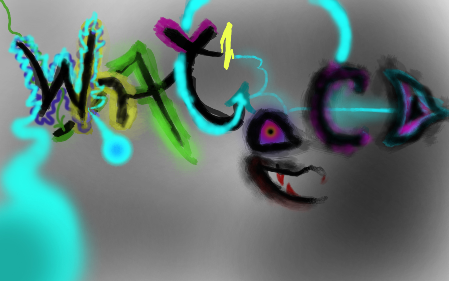
I just figured out a great way to use a knockout with dark backgrounds to create awesome neon colors like you see in that pic


Wish I would have figured it out before I was an hour into it


Total time spent: 1:30
Jenspm
penis
+1,716|6737|St. Andrews / Oslo

wat
https://static.bf2s.com/files/user/26774/flickricon.png https://twitter.com/phoenix/favicon.ico
GodFather
Blademaster's bottom bitch
+387|6224|Phoenix, AZ
Oh yeah, by the way its for a contest hence the website name: what.cd
Jenspm
penis
+1,716|6737|St. Andrews / Oslo

I'm assuming this is for the wallpaper contest;

It's not really working... at all.

There's too much going on, which confuses me. Wallpapers should be simple and clean, imo. This one is way too rough.

When I read it the first 5 times, before you mentioned what.cd, I read it as "wat ecd"

Most of all, it doesn't really represent what.cd, at least not how I see it. Their web-page, logo (both gazelle and what) are simple, clean and with few colors. I'm 90% sure that something like that is going to win the contest. Protip: blue, white and a little black.
https://static.bf2s.com/files/user/26774/flickricon.png https://twitter.com/phoenix/favicon.ico
AussieReaper
( ͡° ͜ʖ ͡°)
+5,761|6157|what

The next one you do will be better now you know the neon colours.
https://i.imgur.com/maVpUMN.png
Finray
Hup! Dos, Tres, Cuatro
+2,629|5793|Catherine Black
Hmm, I don't think I like it.
https://i.imgur.com/qwWEP9F.png
GodFather
Blademaster's bottom bitch
+387|6224|Phoenix, AZ

Jenspm wrote:

I'm assuming this is for the wallpaper contest;

It's not really working... at all.

There's too much going on, which confuses me. Wallpapers should be simple and clean, imo. This one is way too rough.

When I read it the first 5 times, before you mentioned what.cd, I read it as "wat ecd"

Most of all, it doesn't really represent what.cd, at least not how I see it. Their web-page, logo (both gazelle and what) are simple, clean and with few colors. I'm 90% sure that something like that is going to win the contest. Protip: blue, white and a little black.
*second time writing this damn iPhone*

yeah I'm not expecting to win. I just saw the contest and had PS open anyway and I just started doodling and adding stuff and started messing around with some different styles. I was originally going to neon wireframe a boombox with bold letters on top and bottom with a spiral background of some sort but then I got lost in the neon jumping out of the screen and started experimenting with it

as far as that creature that started with me trying to do a two layer period then it formed to an eye then I started fleshing it out etc.

I act on impulse with these

I got positive reception with the last weird ones so I figured why not show bf2s

I'm happy with it, I also learned a few techniques for some really neat effects (neat in my mind at least)


edit: It's initially unreadable because I was using the previous character to make the next one if that makes sense

Again it was a doodle thing, I was trying to see how creative I could be

Now that I look at it I see many improvements I'll make tomorrow

sorry for double post I'll fix it when I'm on the comp tomorrow

Last edited by GodFather (2009-08-11 07:24:49)

Board footer

Privacy Policy - © 2024 Jeff Minard