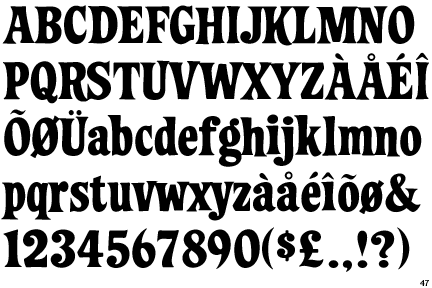
k well ive got sum mailboxes to antique(faux finish painting) not important really. but in the following pic i have a pic of the old mailbox and its address... they want the exact same font, and sure i could go through and get a pic of all the numbers and do it the hard way. but if its an actual font, then i can print up the shits fast and be done with it. any help would be appreciated.

heres the finished mailbox excluding numbers. for the fuck of it

heres the finished mailbox excluding numbers. for the fuck of it

