
6/10, Dont like the Papyrus Text, too Known throughout the land, you know..., Lens flares are a bit too much too....
Last edited by tazz. (2007-07-10 17:54:58)
everything i write is a ramble and should not be taken seriously.... seriously. ♥
Last edited by tazz. (2007-07-10 17:54:58)
Last edited by tazz. (2007-07-11 01:42:13)
2/10[REB]Qrite wrote:
7.5/10
Last edited by xBlackPantherx (2007-07-11 03:33:01)
Here[REB]Qrite wrote:
7.5/10

Last edited by Ninja_Kid2002 (2007-07-11 07:52:47)
8-9 classy and cool.OmniDeath wrote:
9/10 classic
Well on an assumption that you knew that the majority of ratings in this thread are out of 10 I just put 5.Ninja_Kid2002 wrote:
Thanks for the feedback!!!!
Is that 5 out of 5? 5 out of 100?
9/10 for yours, it's great, the yellow text boarder works really well, love the flame reflections, maybe the text could be a different font or centred in the box. Looks like it's sloping too.
oh, but 2/10 really because of your useless rating method!
10/10 Amazing, but who does the new sig team consist of?OmniDeath wrote:
9/10 classic
Wow, if that's not sexist, you can tickle me elmo.r'Eeee wrote:
Don't really like it....Kinda girly 5/10
Rate this as well plz....
http://i103.photobucket.com/albums/m144 … /45644.png
ROFL, because I gave yours 5/10, you have to give me 0/10...Way to go bro way to go...xBlackPantherx wrote:
Wow, if that's not sexist, you can tickle me elmo.r'Eeee wrote:
Don't really like it....Kinda girly 5/10
Rate this as well plz....
http://i103.photobucket.com/albums/m144 … /45644.png
0/10
Too geekish. Looks like he has an orange peel on his head.
Last edited by r'Eeee (2007-07-11 09:40:48)
1) It was a joke.r'Eeee wrote:
ROFL, because I gave yours 5/10, you have to give me 0/10...Way to go bro way to go...xBlackPantherx wrote:
Wow, if that's not sexist, you can tickle me elmo.r'Eeee wrote:
Don't really like it....Kinda girly 5/10
Rate this as well plz....
http://i103.photobucket.com/albums/m144 … /45644.png
0/10
Too geekish. Looks like he has an orange peel on his head.
Actually I am gonna use it, because I like it.
1) Ops, it's kinda hard to detect jokes over teh internet.xBlackPantherx wrote:
1) It was a joke.r'Eeee wrote:
ROFL, because I gave yours 5/10, you have to give me 0/10...Way to go bro way to go...xBlackPantherx wrote:
Wow, if that's not sexist, you can tickle me elmo.
0/10
Too geekish. Looks like he has an orange peel on his head.
Actually I am gonna use it, because I like it.
2) Use what?
I'd rather you not use my sigs without my permission, but seeing as how I just made a new one, would you like your name on it?r'Eeee wrote:
1) Ops, it's kinda hard to detect jokes over teh internet.xBlackPantherx wrote:
1) It was a joke.r'Eeee wrote:
ROFL, because I gave yours 5/10, you have to give me 0/10...Way to go bro way to go...
Actually I am gonna use it, because I like it.
2) Use what?
2) The sig?
Ok, you didn't get it, yet. I meant use the sig I made. Not yoursxBlackPantherx wrote:
I'd rather you not use my sigs without my permission, but seeing as how I just made a new one, would you like your name on it?r'Eeee wrote:
1) Ops, it's kinda hard to detect jokes over teh internet.xBlackPantherx wrote:
1) It was a joke.
2) Use what?
2) The sig?
*cough cough*Click Here*cough cough*AAFCptKabbom wrote:
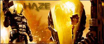
7/10 good graphics, however, glowing yellow/gold doesn't allow for any definition.
I wish I had a cool sig - all I got is all this BLING! BLING!