Haha yours makes me laugh every time,
i like it 8/10
Already rated yours.
I made a new one
I made a new one
pfft...PS haxor
9.5/10
9.5/10
9/10
i like it, simple and nicely done idea, though I don't actually know who the guy in it is
i like it, simple and nicely done idea, though I don't actually know who the guy in it is
Try putting a stroke round the text when you get a chance, maybe a 1px red, or even change the stroke on parts to suit the backgroundIm_Dooomed wrote:
I couldn't figure out a font color to use for my sig that would stand out! The photo is to contrasty. White, black and brown...It is hard to get a font that stands out among those three colors. Suggestions would be good. I guess I could lower the contrast of the photo and then add the type to it. I don't have time today thoughbennisboy wrote:
7/10
I think if you made the text stand out more it would be better. It just needs to jump out more to grab attention
Also at the post above:
7/10
Last edited by bennisboy (2007-06-20 13:54:58)
A tad cut off, but the idea is good: 6.8/10
Its alright, to many bright colors 6/10
There, just made a new one..
plese rate it and suggestions for improving it..
oh and PsychoKillers.. I'd give it a 6/10, the pic is a pretty standard bf2 wallpaper, the borders looks wierd, and the text is kind of hard to read..
plese rate it and suggestions for improving it..
oh and PsychoKillers.. I'd give it a 6/10, the pic is a pretty standard bf2 wallpaper, the borders looks wierd, and the text is kind of hard to read..
I like it, but not too sure about the transparent part. If you take the red bit and leave the women, it will look better.
Oh, can you rate this as well. I made it the other day. Somdy rated it before though!
Oh, can you rate this as well. I made it the other day. Somdy rated it before though!
Last edited by rabee2789b (2007-06-20 16:09:01)
better?rabee2789b wrote:
I like it, but not too sure about the transparent part. If you take the red bit and leave the women, it will look better.
Oh, can you rate this as well. I made it the other day. Somdy rated it before though!
http://i103.photobucket.com/albums/m144 … v5fcvf.png

or this
I like your sig, I'd give it a 8/10.. I like the colors and the overall theme
Last edited by Z-trooper (2007-06-20 16:11:50)
Yea, but I meant the red part on the top around the lady or w/e that thing is!
Nah, it doesn't look good without the red part. Leave it, I would say 8.5/10
Nah, it doesn't look good without the red part. Leave it, I would say 8.5/10
Last edited by rabee2789b (2007-06-20 16:13:14)
heh, I know.. misunderstood it first.. edited it in..rabee2789b wrote:
Yea, but I meant the red part on the top around the lady or w/e that thing is!
Use this one
right'o thats why we use this thread to improve / make final touches I have a very bad habit just adding effects and it becomes messy pretty fast
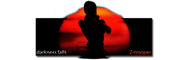
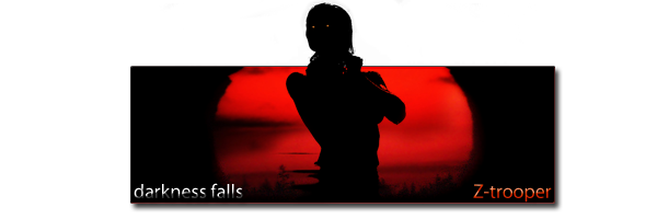
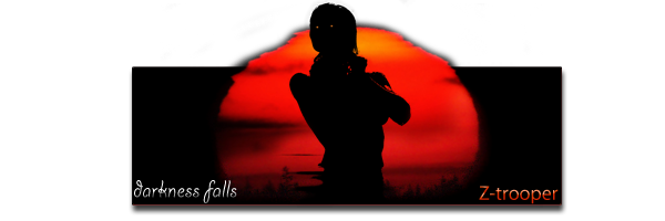
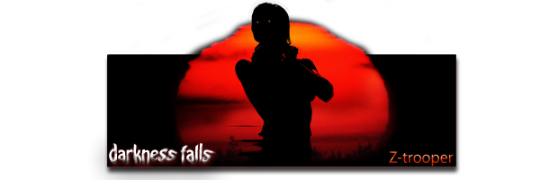
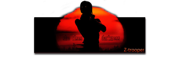
6/10. try writing Darkness falls in a different manner.
@ Z-Trooper: I like it much better than last nights one... 8-10
like the Idea very much, not a huge fan of the red eyes, but thats a matter of personal taste.
by the way, if your looking to centre it, it seems a bit far left.
@ bernadictus 9/10
I like that its a different style than most, good job, I'm not normally a fan of sigs that big, but it seems to work with this one.
plus shes pretty damn funny.
Last edited by Nicholas Langdon (2007-06-20 16:22:58)
sweet idea i gotta say 8/10
Last edited by Criminal (2007-06-20 16:22:10)
1/10 Make on of your own Criminal
Nicholas Langdon: 8/10, simplicity! But try replacing the shadow with a black glow, and a different font face.
Nicholas Langdon: 8/10, simplicity! But try replacing the shadow with a black glow, and a different font face.
yea, you might be right.. I'll try doing some of the stuff I did to my 300 sig.. the text turned out well on that one.Bernadictus wrote:
6/10. try writing Darkness falls in a different manner.
the centering thing was just a shot in the dark.. so I'm aware and regarding the last one - I'm alway trying out some new styles, I don't like seeing those "stylish" sigs 24/7. Cause the stylish sigs are all about keeping it small, small overall size, small simple text (no capital letters), thin border ~1px and then a background "wierd for the sake of wierd"..Nicholas Langdon wrote:
@ Z-Trooper: I like it much better than last nights one... 8-10
like the Idea very much, not a huge fan of the red eyes, but thats a matter of personal taste.
by the way, if your looking to centre it, it seems a bit far left.
I like to play with transparancy and stuff like that - sure I fail 80% of the time but I learn new things all the time
forgot to rate a few..
Nicholas: 5/10, sorry its just too much like the original for my taste, but it looks great
Had I not already used that image for my desktop wallpaper I might have rated it differently.. but thats life..

Bern: 7.5/10 I like the colors, I like thats its not the same old story as many peoples sigs are, and if you had entered it a bit sooner in the sotw 11 I think it would have done pretty good! I'm missing a stronger border I think..
Last edited by Z-trooper (2007-06-20 16:35:25)
made some adjustments.. which one? (if any..)


Last edited by Z-trooper (2007-06-20 16:48:32)
If any, the third one, but I don't like the 'Darkness Falls' text in there. Maybe make it a subtext below your name.
I made a few adjustments on mine. Can you guys see that it is a samurai now?
I made a few adjustments on mine. Can you guys see that it is a samurai now?
@ z-trooper: yeah I know, I just didnt see any point in changing it much, Its already too nice....
just kind of between ideas right now and figured I would use that as something different. I might add a contrasting second sig to it.
like you I dont like those wierd backgrounds so much, actually I do, It just seems their on everything nowadays.
by the way, I like the one already in your sig the best.
@ ryan: 9/10, I like these ones youve been doing...
Last edited by Nicholas Langdon (2007-06-20 16:50:38)
yea, its way better now.. you can actually see the 2nd handRyan wrote:
If any, the third one, but I don't like the 'Darkness Falls' text in there. Maybe make it a subtext below your name.
I made a few adjustments on mine. Can you guys see that it is a samurai now?
however I still dont like the creamy colors sry..
I couldnt agree more..! I'm also out there fishing for ideas.. this is my best one these last 3 days I think.. I've made quite a few, but I really like the colors on this oneNicholas Langdon wrote:
yeah I know, I just didnt see any point in changing it much, Its already too nice....
just kind of between ideas right now and figured I would use that as something different. I might add a contrasting second sig to it.
like you I dont like those wierd backgrounds so much, actually I do, It just seems their on everything nowadays.
Last edited by Z-trooper (2007-06-20 16:51:27)
me 2.. either the last of the new or the one I already use..Nicholas Langdon wrote:
I like the one already in your sig the best.