buLLet_t00th
Mr. Boombastic
+178|6650|Stealth City, UK
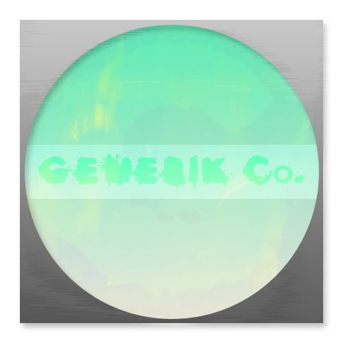
I'd really appreciate it if someone could help with a graphic for a logo of a 'new' clothing company. Its for a University project, and I want it to look proffesional. As I dont have any experience with computer graphic design there's no chance in hell that it'll look good!

What I'd like is pretty simple though:

A grey 'textured' square that has a turquoise circle in it, that doesn't touch any of the sides. And the word GENERIC underneath, or GENERIC Co. with the full stop after it.

Any help would be extremely appreciated!

Thanks very much,

buLLet_t00th

Last edited by buLLet_t00th (2007-05-29 07:01:53)

Entertayner
Member
+826|6779

We can't help you with your school work/projects.
B00MH3ADSH0T
Fresh NoobCaeks Here
+118|6598|Penrith,Nsw, Aus
Took me 2 hours so it should get you a A+

https://img259.imageshack.us/img259/9274/generikza0.png

Last edited by B00MH3ADSH0T (2007-05-29 06:35:01)

Sniper-UK-Ghost
Ice Lolly Maniac
+30|6443|Bristol

Entertayner wrote:

We can't help you with your school work/projects.
why not?!
buLLet_t00th
Mr. Boombastic
+178|6650|Stealth City, UK

Sniper-UK-Ghost wrote:

Entertayner wrote:

We can't help you with your school work/projects.
why not?!
Its not for a graded exam or anything. Just instead of me saying 'this is what it would look like' I'll actually have something to show them.

Having that graphic isn't going to help me pass cause there's nothing to pass, it'll just show what I want the logo to look like.

Last edited by buLLet_t00th (2007-05-29 06:42:16)

dc_involved
Member
+13|6738

B00MH3ADSH0T wrote:

Took me 2 hours so it should get you a A+

http://img259.imageshack.us/img259/9274/generikza0.png
lol, spat half mi sandwich out when i saw this post, +1 to you sir.
dc_involved
Member
+13|6738

buLLet_t00th wrote:

I'd really appreciate it if someone could help with a graphic for a logo of a 'new' clothing company. Its for a University project, and I want it to look proffesional. As I dont have any experience with computer graphic design there's no chance in hell that it'll look good!

What I'd like is pretty simple though:

A grey 'textured' square that has a turquoise circle in it, that doesn't touch any of the sides. And the word GENERIK underneath, or GENERIK Co. with the full stop after it.

Any help would be extremely appreciated!

Thanks very much,

buLLet_t00th
no offense but that idea sounds lame. no need for the k, should just use the word as it is. Generic/Generik - the k offends my eyes. Plus if you are going for something generic like the colours and shapes you have picked why break the theme by using a unique version of the word generic? a contradiction in terms that doesn't work well - even if that was what you were going for. don't mean to be a dick just trying to offer some constructive criticsm.
Ryan
Member
+1,230|7051|Alberta, Canada

B00MH3ADSH0T wrote:

Took me 2 hours so it should get you a A+

http://img259.imageshack.us/img259/9274/generikza0.png
That's great and all, but he said to put the words underneath the circle.
S.Lythberg
Mastermind
+429|6655|Chicago, IL
remember this?

were not that helpful....
buLLet_t00th
Mr. Boombastic
+178|6650|Stealth City, UK

dc_involved wrote:

buLLet_t00th wrote:

I'd really appreciate it if someone could help with a graphic for a logo of a 'new' clothing company. Its for a University project, and I want it to look proffesional. As I dont have any experience with computer graphic design there's no chance in hell that it'll look good!

What I'd like is pretty simple though:

A grey 'textured' square that has a turquoise circle in it, that doesn't touch any of the sides. And the word GENERIK underneath, or GENERIK Co. with the full stop after it.

Any help would be extremely appreciated!

Thanks very much,

buLLet_t00th
no offense but that idea sounds lame. no need for the k, should just use the word as it is. Generic/Generik - the k offends my eyes. Plus if you are going for something generic like the colours and shapes you have picked why break the theme by using a unique version of the word generic? a contradiction in terms that doesn't work well - even if that was what you were going for. don't mean to be a dick just trying to offer some constructive criticsm.
Wooaaahhhh, I didn't put that much thought into it. What I'm doing is not about the name or logo exactly, its mainly aimed at how to start up the company, what funds I'd need, how I'd get them, how I'd get the product out there, where I'd get materials from etc.
I'll change it if you want, would that please you?
twiistaaa
Member
+87|6876|mexico
was bored. its not under the circle tho.

https://i143.photobucket.com/albums/r139/twiistaaa/generic.jpg
Entertayner
Member
+826|6779

Not what you asked for but meh..

https://img267.imageshack.us/img267/2729/generikpg9.png

-E- Colours look off on this background.

Last edited by Entertayner (2007-05-29 08:12:43)

dc_involved
Member
+13|6738

buLLet_t00th wrote:

dc_involved wrote:

buLLet_t00th wrote:

I'd really appreciate it if someone could help with a graphic for a logo of a 'new' clothing company. Its for a University project, and I want it to look proffesional. As I dont have any experience with computer graphic design there's no chance in hell that it'll look good!

What I'd like is pretty simple though:

A grey 'textured' square that has a turquoise circle in it, that doesn't touch any of the sides. And the word GENERIK underneath, or GENERIK Co. with the full stop after it.

Any help would be extremely appreciated!

Thanks very much,

buLLet_t00th
no offense but that idea sounds lame. no need for the k, should just use the word as it is. Generic/Generik - the k offends my eyes. Plus if you are going for something generic like the colours and shapes you have picked why break the theme by using a unique version of the word generic? a contradiction in terms that doesn't work well - even if that was what you were going for. don't mean to be a dick just trying to offer some constructive criticsm.
Wooaaahhhh, I didn't put that much thought into it. What I'm doing is not about the name or logo exactly, its mainly aimed at how to start up the company, what funds I'd need, how I'd get them, how I'd get the product out there, where I'd get materials from etc.
I'll change it if you want, would that please you?
I thought it was a design project, my bad. its not about pleasing me its about your project right? if you do it well enough why not start the business up? Branson it!

Its too late for you to patent it now any way as its in the public domain.

I'm on the phone to china, counterfeiting your goods j/k.

Board footer

Privacy Policy - © 2024 Jeff Minard