reverse ownageSEREMAKER wrote:
can't get owned if I didn't payseb--morin wrote:
Saddly you got owned...
500 dolla plz.
Seen a toddler make something more creative
Dont pay this guy!
Dont pay this guy!
Yeah, what that toddler created is in the post above
5 min pshop... 495 bucks... lol

Last edited by [TUF]Catbox (2008-02-23 15:50:35)
Love is the answer
It's sucky sucky tbh
That's 100 times better than the crap in the OP.[TUF]Catbox wrote:
5 min pshop... 495 bucks... lol
http://i17.photobucket.com/albums/b90/c … store2.jpg
While not completely, wrong a lot of matters come into play.Jenspm wrote:
you don't need illustrator to make a logo. Sure, it's the better program for logo-creation, but one could make a damn good logo in PS as well.Zimmer wrote:
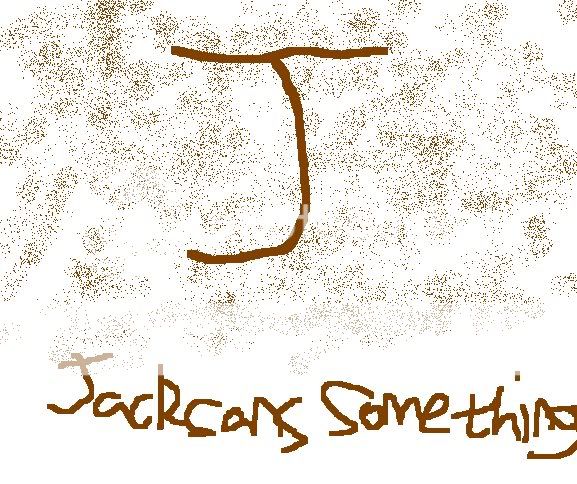
It's not a logo. It's a stupid little effect on Photoshop.Uzique wrote:
It looks pretty good, I certainly wouldn't glance at it twice and think "What the hell?" if it was the theme/logo for your store or enterprise.
Having said that, if you really wanted to nitpick... the text could be a little better. Also, as Jsnipy said- if you want to build a brand then focus on making it more recognizable. Just a 'J' won't do much for brand recognition... mind you, if it's a small-time enterprise then what does it matter?
Best of luck!
Edit: WHOAH! $500.00 for that logo? It's a satisfactory logo and all but I'm sure any Photoshop / design student could cook something up that equaled or surpassed it in quality in less than a day. 500 dollars worth of labour implies that he worked on this for at least a week... which I would find hard to believe. A rightful investigation imho!
Logos are done in Illustrator and are meant to mean something at the same time as being recognisable by any idiot he sees it.
A 3 months PS noob could put together a better logo than that. It's ugly, it's pointless and it's ugly.
First off- size. Logos are used at many different sizes. Coffee cups, t-shirts, return address on labels, pens, mouse pads, Banners, wall mountings et all... not to mention ads. And do not forget about trade shows. By sticking only with PS you would run into problems with resolution. Print 266-300ppi, web 72ppi, trade-show work 100ppi at size)You may have to have several files for every size. Not to mention layer styles change at various resolutions, and NO you can not just "add" resolution, that does not work. What about only spot color jobs? One color jobs? two color jobs? Black and White? Tough to show those cool blurs and glosses in a one color job let alone BW. And all those cool filters you use... only available in RGB, print is done in a CMYK world, so you will have color correction issues. Wouldn't it be easier to have a nice CMYK vectored version that you could just send to the printer? Or throw some effects on when doing something for the web? Instead of re-sizing and color correcting all day per job. We do this (design) to make money, not waste time.
Bottom line most COMPANY logos are built in Illustrator (or corel) and then "snazzed up" in PS for certain applications. Though you can snazz up pretty well in illustrator with opacity masks and blends among other tricks, if you know the program well.
However, there are always exceptions to the rule. I work for a coin-op game company and our "game" logos are usually started in Illy but finished in PS with a heavy amount filters and fun. Our logos only live in a digital world (RGB) and rarely exceed web size (72ppi). Thats the great thing about design, there are no rules...only guidelines. But the guidelines say if your looking to make money off logos, be smart and have a resolution independent version available. A client will not pay you every-time they need a logo for everything.
So yeah you can use PS to make logos... but it is not the smartest way to work.
Agreed, you could make that logo in under 10 mins...Zimmer wrote:
It's not a logo. It's a stupid little effect on Photoshop.Uzique wrote:
It looks pretty good, I certainly wouldn't glance at it twice and think "What the hell?" if it was the theme/logo for your store or enterprise.
Having said that, if you really wanted to nitpick... the text could be a little better. Also, as Jsnipy said- if you want to build a brand then focus on making it more recognizable. Just a 'J' won't do much for brand recognition... mind you, if it's a small-time enterprise then what does it matter?
Best of luck!
Edit: WHOAH! $500.00 for that logo? It's a satisfactory logo and all but I'm sure any Photoshop / design student could cook something up that equaled or surpassed it in quality in less than a day. 500 dollars worth of labour implies that he worked on this for at least a week... which I would find hard to believe. A rightful investigation imho!
Logos are done in Illustrator and are meant to mean something at the same time as being recognisable by any idiot he sees it.
A 3 months PS noob could put together a better logo than that. It's ugly, it's pointless and it's ugly.
Sometimes the simple things are more effective. Like girls and sex positions, or even my sig

sig's too bigtwoblacklines wrote:
Sometimes the simple things are more effective. Like girls and sex positions, or even my sig
http://twoblacklines.com/sigs/bigsig.jpg

$500? FFS I used to do graphics work for xFire for less than that...SEREMAKER wrote:
he attached a bill for $500 for labor, time and effortbuLLet_t00th wrote:
How much for that?
he now has an investigation penning
lol, everytime he resizes it, it's still too big. Maybe he'll take a hint and look at other member's sigs, or the rules.cowami wrote:
sig's too bigtwoblacklines wrote:
Sometimes the simple things are more effective. Like girls and sex positions, or even my sig
http://twoblacklines.com/sigs/bigsig.jpg
...Bahahahaha!
My opinion on that has been summed up already.
My opinion on that has been summed up already.
I'm a printer . . . as far as printing things like envelopes, business cards, letterhead, etc, it really sucks. With a wood background you'd have to do everything in 4 color process which is expensive. Best to keep things to 3 spot colors or less tbh.
Fail logo is fail. I'd hardly even call it a logo for that matter.
Omnideath! I choose you!OmniDeath wrote:
Fail logo is fail. I'd hardly even call it a logo for that matter.
Flaming_Maniac wrote:
Omnideath! I choose you!OmniDeath wrote:
Fail logo is fail. I'd hardly even call it a logo for that matter.

...SEREMAKER wrote:
can't get owned if I didn't payseb--morin wrote:
Saddly you got owned...
True... but he is owning you in wasted time. And he owns all of us because his logo makes our eyes bleed.
That's just horrible and ugly.
...
#1 Like Zimmer said,... Logos are created in a vector based program like Illustrator or that other one in Corell.
#2 It looks like somebody shit that logo out of their ass.
#3 Have toilet paper in hand.

That isn't a logo. That's something someone threw together with no design knowledge at all.
♥
Sadly, you can't spellseb--morin wrote:
Saddly you got owned...
You fail

Rushed and amateur. I could do better and I have no knowlege of anything design-ey.
They expect $500 for that? They are seriously delusional. It's not a logo, it's a poorly drawn letter on a cut-and-pasted background with illegible writing.
They expect $500 for that? They are seriously delusional. It's not a logo, it's a poorly drawn letter on a cut-and-pasted background with illegible writing.
[Blinking eyes thing]
Steam: http://steamcommunity.com/id/tzyon
Steam: http://steamcommunity.com/id/tzyon
Logos are supposed to be designed in a vector format. Keep it simple and scalable, or else it's going to be out of place and unreadable on different types of media.

YEah, so they dont pixalate if you want them bigger.... i'n not that good at logos, ive madea few but gave up
everything i write is a ramble and should not be taken seriously.... seriously. ♥