Ok, you have 24 hours to vote for your favourite sig, at the end, whichever has the most votes will win. Voting will stop at Midnight 29 May.
1.
2.
3.
4.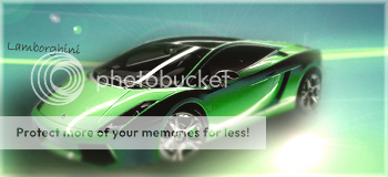
5.
6.
7.
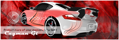
8.
9.
10.
1.
2.
3.
4.
5.
6.
7.
8.
9.
10.
| 1 | 5% | 5% - 7 | ||||
| 2 | 6% | 6% - 8 | ||||
| 3 | 18% | 18% - 22 | ||||
| 4 | 10% | 10% - 13 | ||||
| 5 | 24% | 24% - 29 | ||||
| 6 | 1% | 1% - 2 | ||||
| 7 | 4% | 4% - 5 | ||||
| 8 | 2% | 2% - 3 | ||||
| 9 | 5% | 5% - 6 | ||||
| 10 | 20% | 20% - 24 | ||||
| Total: 119 | ||||||


Last edited by Flecco (2007-05-28 23:10:38)
Last edited by acEofspadEs6313 (2007-05-28 23:13:14)
Let me guess, yours is 5?OmniDeath wrote:
i cant believe so many people are voting for one. no offense, but the mustang looks terribly deformed and it is unattractive overall. i think 8 isnt getting as much credit as it deserves...
lol, no.LT.Victim wrote:
Let me guess, yours is 5?OmniDeath wrote:
i cant believe so many people are voting for one. no offense, but the mustang looks terribly deformed and it is unattractive overall. i think 8 isnt getting as much credit as it deserves...
Last edited by OmniDeath (2007-05-29 01:04:52)
It got 5 votes, thats all.. I dont get the need for commenting on it when there were 3-4 with 10+ at the moment..OmniDeath wrote:
i cant believe so many people are voting for one. no offense, but the mustang looks terribly deformed and it is unattractive overall. i think 8 isnt getting as much credit as it deserves...
Then he wrotePM wrote:
its meant to be deform, its meant to enhance the brute features of the original... people just like different styles, and clearly you dont like it.. thats fine by me, thats the point of this SOTW I believe, to see what people can do with a different style.. you should think a routined sigmaker like you would be open to things like this, but oh well, everyone has an oppinion and the right to share it..
OmniDeath wrote:
im not complaining about votes being stolen or anything, i dont care about winning these things (id think people would realize that by now) i just dont think 1 is as good as some others that arent doing so hot, like 8. although, i got a nasty pm (most likely from the creator of 1) about how the mustang was supposed to look deformed
I dont see where I was offensive? please tell me where if you accuse me of writing a nasty PM..Nasty? wrote:
although, i got a nasty pm
its the public thats doing the voting, so if it was so horrible, I dont get why its firmly placed in the middle of the bunch.. or maybe everyone in here is not as well educated in the art of sigs as you are.. /no offence intended..Omnideath wrote:
i just dont think 1 is as good as some others that arent doing so hot,
Last edited by Z-trooper (2007-05-29 01:57:09)