MorbiD.ShoT
Stormin' through the party
+322|6804
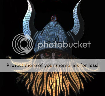
And it's Viking Death Metal related, not that it matters but that is why there's an angry Viking on the cover. 

I would just like to know, based on your opinions, what else I might add, How does it look so far and do you like it overall?
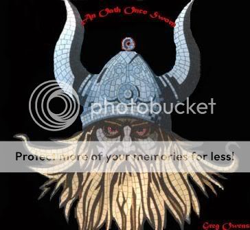
https://i56.photobucket.com/albums/g163/ultimate5metal/vikingnew.jpg
cowami
OY, BITCHTITS!
+1,106|6498|Noo Yawk, Noo Yawk

It looks pretty badass. But don't take my word for it, I'm no graphics/marketing pro.
https://i.imgur.com/PfIpcdn.gif
Miller
IT'S MILLER TIME!
+271|6964|United States of America
Fire in his eyes!
MorbiD.ShoT
Stormin' through the party
+322|6804

Miller wrote:

Fire in his eyes!
The eyes are more red in PS CS2...but yes, fire in the eyes would be wicked.

I was thinking about lightning in the background?

Ideas on this?
PspRpg-7
-
+961|6906

I like the look of it the way it is.
S.Lythberg
Mastermind
+429|6655|Chicago, IL
Lightning in the background, as that is Thor's weapon of choice
Switch
Knee Deep In Clunge
+489|6671|Tyne & Wear, England
Incorporate some Norse mythology into it.  I dunno, like Odin's Ravens in the background or something.  Or perhaps the hammer of Thor??
Somewhere, something incredible is waiting to be known.
MorbiD.ShoT
Stormin' through the party
+322|6804

KILLSWITCH wrote:

Incorporate some Norse mythology into it.  I dunno, like Odin's Ravens in the background or something.  Or perhaps the hammer of Thor??
Aye, maybe Thor's hammer.  I could use my vast expanse of fantasy/medieval knowledge and incorporate some stuff in there.

Lightning then?  Exploding in the background maybe?
Switch
Knee Deep In Clunge
+489|6671|Tyne & Wear, England
Fork lightning would look sweet, try and give the impression that its coming towards the viewer's perspective.
Somewhere, something incredible is waiting to be known.
MorbiD.ShoT
Stormin' through the party
+322|6804

KILLSWITCH wrote:

Fork lightning would look sweet, try and give the impression that its coming towards the viewer's perspective.
Alrighty then.  I've only just learnt how to use PS, so i'll try my best.  It'll be finished by Monday and I'll post it on here.  It's for my AP Lit class, my teacher said some bullshit about 7 songs for 1 book.  I said "Fuck that, I'm putting all death metal on this."

Any other suggestions?
AudioAtomica
Member
+53|6458
Wtf Morbid, I never knew you could beast on CS2 like that. Get on x-fire and teach me.
MorbiD.ShoT
Stormin' through the party
+322|6804

AudioAtomica wrote:

Wtf Morbid, I never knew you could beast on CS2 like that. Get on x-fire and teach me.
I would have let you think I'm good at PS, but in all honesty I am not.  I got the picture like that and just deleted/touched-up/added some stuff.

See?

http://images.google.com/images?hl=en&a … &gbv=2
OmniDeath
~
+726|6852

change the text, too hard to read. the font might be ok, but red on black is ugly here, especially when there is no red in the image.
AudioAtomica
Member
+53|6458

MorbiD.ShoT wrote:

AudioAtomica wrote:

Wtf Morbid, I never knew you could beast on CS2 like that. Get on x-fire and teach me.
I would have let you think I'm good at PS, but in all honesty I am not.  I got the picture like that and just deleted/touched-up/added some stuff.

See?

http://images.google.com/images?hl=en&a … &gbv=2
/cries.
mtb0minime
minimember
+2,418|6863

Looks pretty cool, but yes, change the font so it's readable. And I also recommend some sort of background. Not something that's intriguing enough to take away from the Viking, but something to fill in the space so it's not just a head.
Home
Section.80
+447|7056|Seattle, Washington, USA

I like it as is, nice and simple.
Ty
Mass Media Casualty
+2,398|6982|Noizyland

Consider having a different colour background than just black. The harsh black against the not so harsh, (colour-wise,) Viking make it look kind of like a novice pasted an image on a black background in MS Paint.
[Blinking eyes thing]
Steam: http://steamcommunity.com/id/tzyon
MorbiD.ShoT
Stormin' through the party
+322|6804

Ty wrote:

Consider having a different colour background than just black. The harsh black against the not so harsh, (colour-wise,) Viking make it look kind of like a novice pasted an image on a black background in MS Paint.
I wanted to do some blending of colors like a fade from black or fade to black (lol metallica) but I know not how to do this.
Ty
Mass Media Casualty
+2,398|6982|Noizyland

Consider asking some in-the-know people here to help you out, that's what I did when I was designing my T-shirt.

Edit: If you give me a picture of the Viking or even just the album cover minus the words I can make it have a white glow kinda thing which may make it look a bit less harsh. That's about the extent of my computer image editing skill though.
[Blinking eyes thing]
Steam: http://steamcommunity.com/id/tzyon
HeavyMetalDave
Metal Godz
+107|6866|California
Give him a mowhawk..

earings and a nose ring...

and lazers should be shootin outta his eyes...


Coz someone might get it confused with French Hate Metal...

Viking Death Metal ... gimme a break... I cant stop laughing...
MorbiD.ShoT
Stormin' through the party
+322|6804

HeavyMetalDave wrote:

Give him a mowhawk..

earings and a nose ring...

and lazers should be shootin outta his eyes...


Coz someone might get it confused with French Hate Metal...

Viking Death Metal ... gimme a break... I cant stop laughing...
What would rather have me call it then "Heavy Metal" Dave?  Swedish Death Metal?  Gothenburg Death Metal?  Melodic Death Metal? 

I gave it that name because the band I had in mind sings only about Wars/rape/killing/fire/swords/helms/boiled leather/leather jerkins/plate...Would you like me to continue or would you rather mock me some more?

I can go on.
Ty
Mass Media Casualty
+2,398|6982|Noizyland

There are so many offshoots of "metal" that you can have anything, I HAVE heard of "Teletubby Metal". I don't really see how it matters.
Anyway, I tried darkening your Viking, Morbid and I reckon it looks a bit better. You can make up your own mind though, have a squiz:
https://i49.photobucket.com/albums/f266/Tyferra/Vikingdarker.png
You do have the rights to use this image right?
Another option would to have the Viking be kind of trasparent, kind of a part of the background rather being a feature image. Depends what you want to go for. I reckon an old Viking coin would be a neat feature picture too, I have a Viking Coin pendant so I can design an image from scratch which takes away the possibility of any unfortunate intelectual property theft lawsuits further down the line.
[Blinking eyes thing]
Steam: http://steamcommunity.com/id/tzyon
DonFck
Hibernator
+3,227|6840|Finland

If the band can afford the printing, you could do a matte black background and a glossy viking. The background could also have glossy black runes.
I need around tree fiddy.
Mr.Dooomed
Find your center.
+752|6536

I liked what Ty did so I added to his peice and created the following:

https://img99.imageshack.us/img99/1240/vikingcoverhs3.png

I liked the lens flare at the center but I can move it. Over one eye looked kinda cool, but not great
Nature is a powerful force. Those who seek to subdue nature, never do so permanently.
Entertayner
Member
+826|6779

A background fitting with theme, better text and for this thread to be in the graphics section.

Board footer

Privacy Policy - © 2024 Jeff Minard