Dont use lense flairs imo
10/10. I really like that sig. Nice text.
9/10.
Good graphs, but I dont recognise da lady...
Good graphs, but I dont recognise da lady...
4/10 pick one, two is too much...
the cat one would get higher, and the first one is to big...
the cat one would get higher, and the first one is to big...
it's good, try making the next blend in more tho. 7/10

^^^
9/10
looks great. like it, although i cant figure out, what is displayed. sort of cosmic image?
edited mine.
9/10
looks great. like it, although i cant figure out, what is displayed. sort of cosmic image?
edited mine.
Last edited by MeanMachine77 (2007-06-17 09:29:39)
A slightly edited lolcat and a stat sig 3/10
main battle tank karthus medikopter 117 megamegapowershot gg
5/10
If it was the dog-tagger-dagger 10/10
If it was the dog-tagger-dagger 10/10
Your thoughts, insights, and musings on this matter intrigue me
6/10, cats annoy me, but cool idea making it look like its holding the userbars
Can the next person please rate this, and tell me what you would rather me do with it (especially the name, couldnt find a place for it)
Can the next person please rate this, and tell me what you would rather me do with it (especially the name, couldnt find a place for it)
Do my trick. Put it hanging in the empty part on the left with low opacity (angled ~25 degrees). it might fit there.
But for the sig otherwise. I like it. It's clean and simple. 8/10
But for the sig otherwise. I like it. It's clean and simple. 8/10
Last edited by DeathUnlimited (2007-06-17 14:25:04)
main battle tank karthus medikopter 117 megamegapowershot gg
Nice, simple design. 8/10. 10/10 if it had the dog-tags.
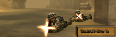
Is this any better?

Please rate this one not my current one
Is this any better?
Please rate this one not my current one
Last edited by ShadowStalker_fx (2007-06-17 14:38:19)
Yes I like it, but a bit angle woluld make it even better. I'll post a n example.ShadowStalker_fx wrote:
Nice, simple design. 8/10. 10/10 if it had the dog-tags.
Is this any better?
http://i186.photobucket.com/albums/x316 … copy-1.png
Please rate this one not my current one
EDIT: Like this:

Last edited by DeathUnlimited (2007-06-17 14:46:10)
main battle tank karthus medikopter 117 megamegapowershot gg
Good, 8/10, but the people are.. very pixelly, while the background looks smooth.
EDIT: Wrong person.
DU, 8/10. No dogtags?
EDIT: Wrong person.
DU, 8/10. No dogtags?
Last edited by Undetected_Killer (2007-06-17 14:39:51)
nice sig 7/10. the background is smoother as it has been blurred, to make the people stand out more. but yeh i see what you mean
Mmmm...aj0's work?
7/10
I can't complain, or else aj would have my balls (cause it'd be like complaining about mine).
EDIT: Slow poster.
8/10
Like everyone else said, simple. And the background seems to curve, kinda like a panorama.
7/10
I can't complain, or else aj would have my balls (cause it'd be like complaining about mine).
EDIT: Slow poster.
8/10
Like everyone else said, simple. And the background seems to curve, kinda like a panorama.
Last edited by cowami (2007-06-17 14:42:09)

like the sig itslef but the userbars and quotes underneat hurt my eyes, ty making the quotes one colour and sperate with : or somthing lol
So bright at this time at night. Quite funny though:) 6/10
6/10...its ok
3/10
funny... but less funny each time I see it...
also the bragging dosent do it for me.... Its what really killed it..
funny... but less funny each time I see it...
also the bragging dosent do it for me.... Its what really killed it..
Good work, looks pretty cool
8/10
8/10
looks good, and nice set up of smaller images.. this is a rare "grade" comming from me, but:Swope wrote:
Good work, looks pretty cool
8/10
10/10
I liked your old one better m8......
Don't really like historic stuff in sigs.....
Well you made mine so lets see what the next one rates it at
Don't really like historic stuff in sigs.....
Well you made mine so lets see what the next one rates it at
Your thoughts, insights, and musings on this matter intrigue me
9/10
7/10
too........ plain?
too........ plain?
6/10, a bit old.