Kinda cool. 5.9/10
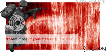
I changed mine up a bit. Flipped it horizontally and make the colors better.
I changed mine up a bit. Flipped it horizontally and make the colors better.
Go ahead, support me like a bra, manGooners wrote:
Yeah, It looks better that way. And btw I would send you the Crysis font if you need. Also, I would support you for mod status

Last edited by Z-trooper (2007-06-14 07:52:03)
Last edited by surgeon_bond (2007-06-14 08:52:15)

SargeV1.4 wrote:
I don't like it to be honest - the MEC soldier and the background just don't blend. The square shape doesn't look nice with all the transparent stuff around it, and the text is a bit boring
[/zimmer]
Nice sig man...Z-trooper wrote:
Funky, different.. new thing you are into Alpha? saw the one you made for ThomasMorgan aswell
I'd say 8/10.. the top and bottom borders needs to be cleaned up imo
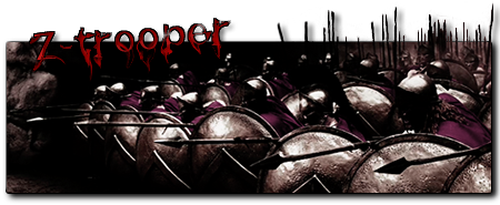
anyways.. I have a new sig up.. I just LOVE the movie 300 so I made myself a sig...
http://i192.photobucket.com/albums/z232 … es/300.png
rate
Last edited by rabee2789b (2007-06-14 09:32:27)
Last edited by lavadisk (2007-06-14 11:41:28)

Hahaha! nice.. its the second time I've been asked where I got that font todayIm_Dooomed wrote:
Yay 300 I like the text and color. Where did u find the 300 font? 9/10
I am always trying something funny/new so?

Last edited by Im_Dooomed (2007-06-14 13:26:27)