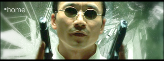
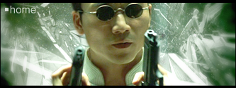
Which of these 2 is better, and please give constructive criticism on both.
Last edited by Home (2007-07-21 20:20:34)
Last edited by Home (2007-07-21 20:20:34)
I personally like the first one; a little more symmetrical. However, I can't help but feel that the little white star looking thing on the bottom left corner of the first one seems out of place.Home wrote:
http://i106.photobucket.com/albums/m271 … phsig1.png http://i106.photobucket.com/albums/m271 … phsig2.png
Which of these 2 is better, and please give constructive criticism on both.

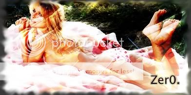
lol the chick from big brother i hate that show so bad.. Any way heres some of the sigs i made let me know what you think of them ive only had photoshop for a week so its nothing pr0. The other two are in my sig already.Swope wrote:
I start to work with brushes and it's fantastic, there are some many possibilities to draw with those.
Here is one I made with brushes:
http://img523.imageshack.us/img523/4282 … uttxv7.png


Last edited by B00MH3ADSH0T (2007-07-22 10:17:01)
But she's damn hotB00MH3ADSH0T wrote:
lol the chick from big brotherSwope wrote:
I start to work with brushes and it's fantastic, there are some many possibilities to draw with those.
Here is one I made with brushes:
http://img523.imageshack.us/img523/4282 … uttxv7.png
Last edited by Swope (2007-07-22 10:28:51)
#4 and #5 where the first two i made, my fav would be number 2 or the wolverine one in my sigSwope wrote:
But she's damn hotB00MH3ADSH0T wrote:
lol the chick from big brotherSwope wrote:
I start to work with brushes and it's fantastic, there are some many possibilities to draw with those.
Here is one I made with brushes:
http://img523.imageshack.us/img523/4282 … uttxv7.png
Edit:
#1: You could put the person a little in front of the sig, but nice sig
#2: Good effects and good picture, awesome
#3: Matrix style hm? Too much effects, i know that's wake with a z-10 and cobra but it's hard see it well
#4: Simple
#5: Sexy


Last edited by tazz. (2007-07-23 04:53:32)
I like number boobs #5tazz. wrote:
You can see how you have proggressed significully, your turning into an awesome sigmaker...
Watch this...
(TIME OF JUST UNDER 2 MONTHS!!!)
In order from first to present, skipping a few, lol...
http://tazz.me/static/photobucket/ProfileBanner2.png
http://tazz.me/static/photobucket/Sig_1copy.png
http://tazz.me/static/photobucket/Sig_3.png
http://tazz.me/static/photobucket/Sig_4.png
http://tazz.me/static/photobucket/Tazzcopy-2.png
http://tazz.me/static/photobucket/Watercopy2.png
http://tazz.me/static/photobucket/15copy.png
http://tazz.me/static/photobucket/Sunsetcopy2.png
http://tazz.me/static/photobucket/Sig_001.png
http://tazz.me/static/photobucket/Heads.png
Do you think i have progressed?
EDIT: Funny just looking at them and realising the different techniques i have banished from my brain and the awesome techniques i have picked up...

It does have a focal point. When we work on things too long we begin to see them different than someone else would (a "fresh eye"). Come back to it in a few hours, or even a day and you will see things different about it than you did before. Right now, my eye is drawn straight to the text because of the strong contrast it has with the dark are behind it. I like the colors and the text in this sig more than your old one. I still think (as I said before) that this one also has a lot of "empty space." While there is some activity like the light effect, I don't think it is enough to fill the gap, or make it interesting enough.Smithereener wrote:
Tried a new sig. I somewhat got layering down and experimented a lot with gradients. Accidentally used a gradient that produced that dark side, and it worked out fairly well I think. I think it's much better than my first one. However, the one gripe I have with it now is that it doesn't seem to have a focal point. But when I tried to make something standout, it would stand out too much. Oh well. Constructive criticism and suggestions are greatly appreciated.
http://img68.imageshack.us/img68/4585/signatureyz6.png
And, if possible, I would like a comparison between my first (current sig) and this one with pros(if any) and cons to see any real improvements.
Last edited by OmniDeath (2007-07-23 22:57:55)
I was trying to fill in the gap with something, but nothing really fit. Didn't blend well, or just looked plain tacky. Thanks for the feedback though, I think I'm going to work on this one a little more later, see if I can fill it up a tad.OmniDeath wrote:
It does have a focal point. When we work on things too long we begin to see them different than someone else would (a "fresh eye"). Come back to it in a few hours, or even a day and you will see things different about it than you did before. Right now, my eye is drawn straight to the text because of the strong contrast it has with the dark are behind it. I like the colors and the text in this sig more than your old one. I still think (as I said before) that this one also has a lot of "empty space." While there is some activity like the light effect, I don't think it is enough to fill the gap, or make it interesting enough.Smithereener wrote:
Tried a new sig. I somewhat got layering down and experimented a lot with gradients. Accidentally used a gradient that produced that dark side, and it worked out fairly well I think. I think it's much better than my first one. However, the one gripe I have with it now is that it doesn't seem to have a focal point. But when I tried to make something standout, it would stand out too much. Oh well. Constructive criticism and suggestions are greatly appreciated.
http://img68.imageshack.us/img68/4585/signatureyz6.png
And, if possible, I would like a comparison between my first (current sig) and this one with pros(if any) and cons to see any real improvements.
Edit:
Pros:
Better color
Improved text
More subtle
Cons:
Less interesting composition (imo)
Not much else really...
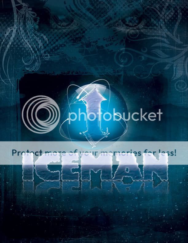
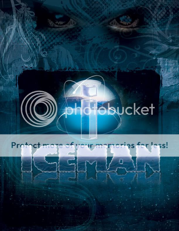


I'm liking the first one more. The eyes are too strong in the second one, and I like the logo in the first one. Maybe make the text reflection a little more subtle, so it doesn't end so abruptly?GraphicArtist J wrote:
Critique this project I'm creating right now. What do you think? I have two versions.
...
http://i89.photobucket.com/albums/k202/ … Iceman.jpg
...
or
...
http://i89.photobucket.com/albums/k202/ … cemanB.jpg

Last edited by ebug9 (2008-07-17 15:22:55)
Don't blame me, blame the tutorialkonfusion wrote:
Is that render>clouds? Because I'd say that's the only bad thing about it
-kon

Last edited by ebug9 (2008-07-18 12:55:08)
